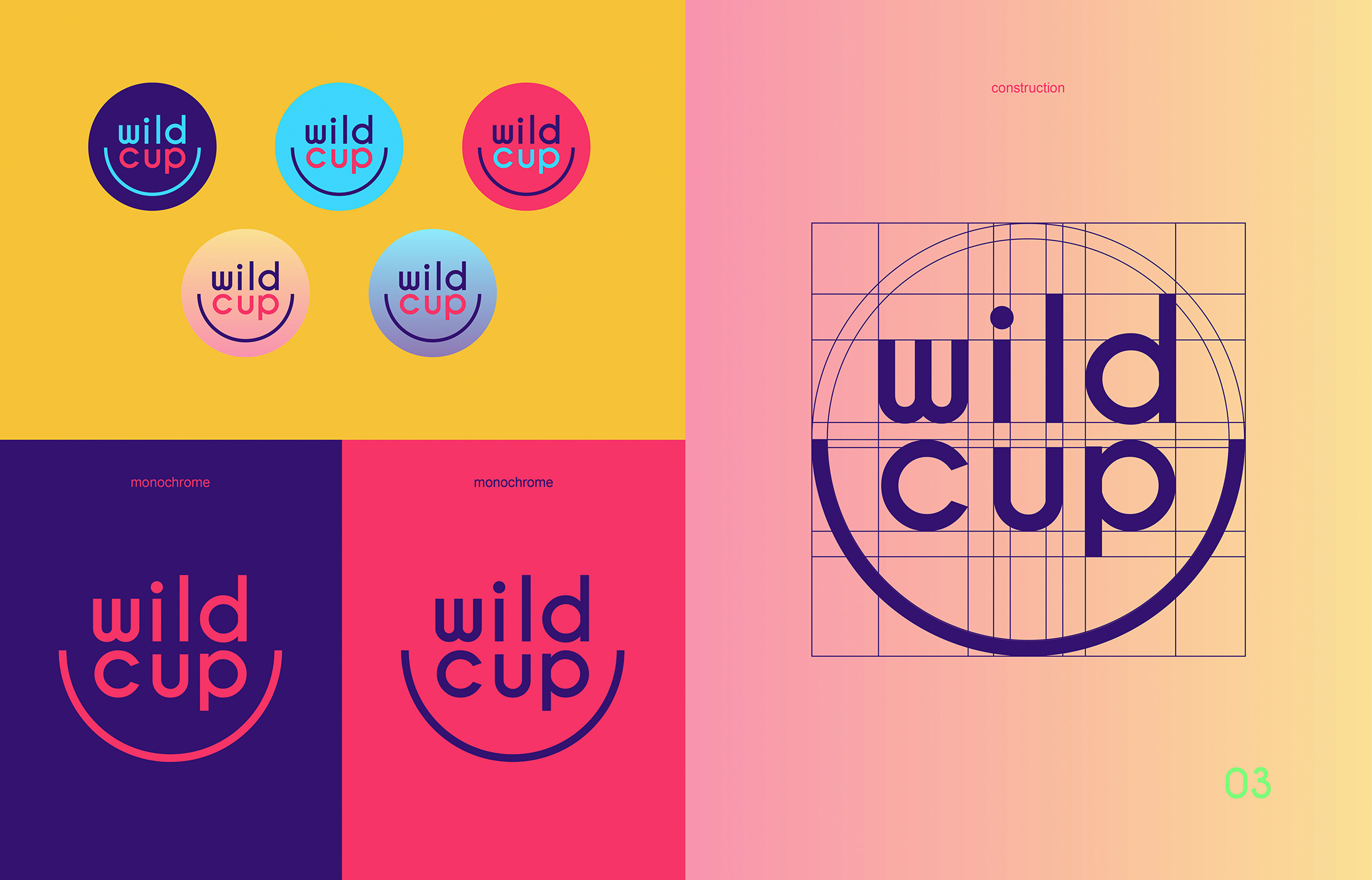
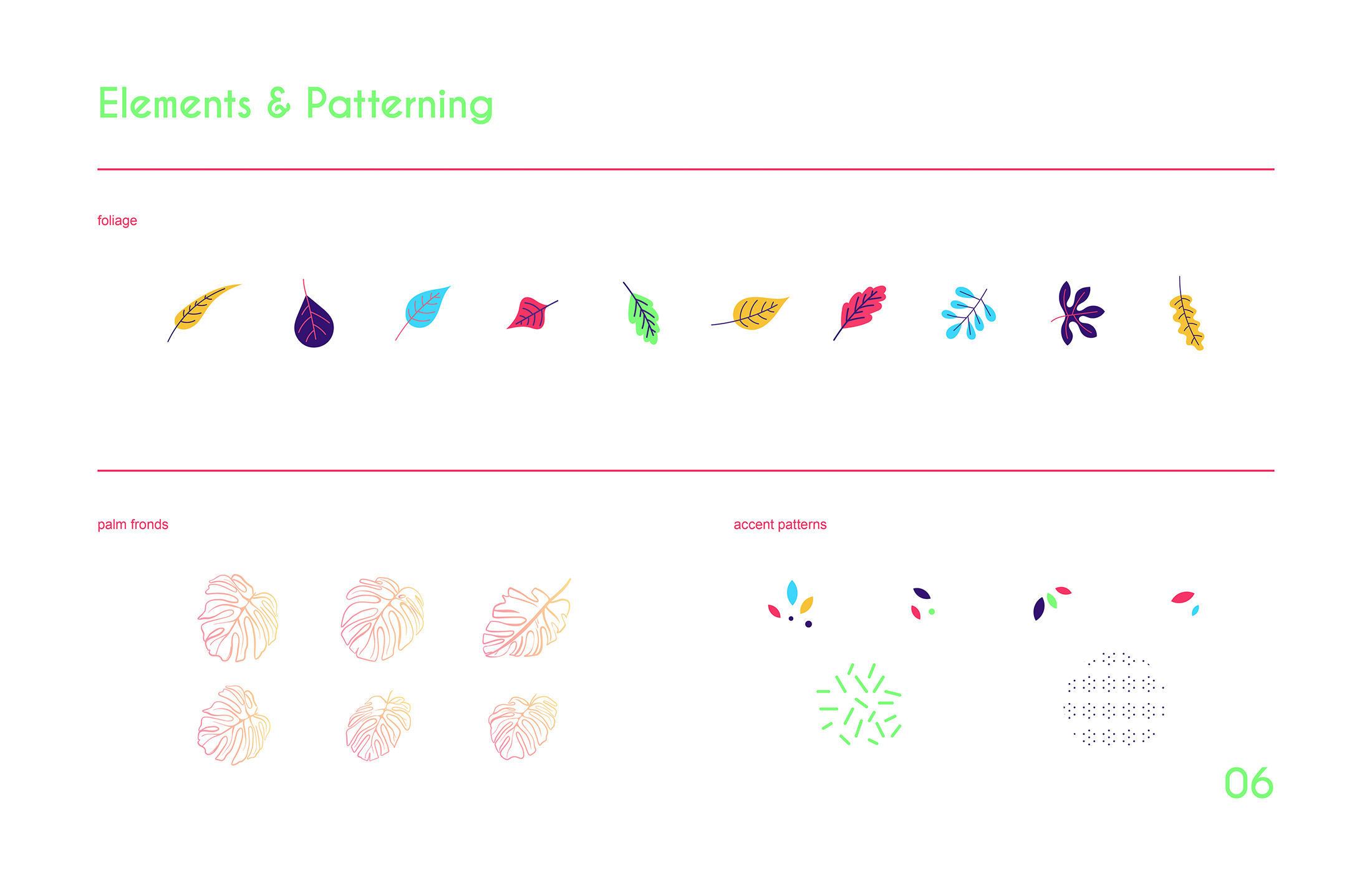
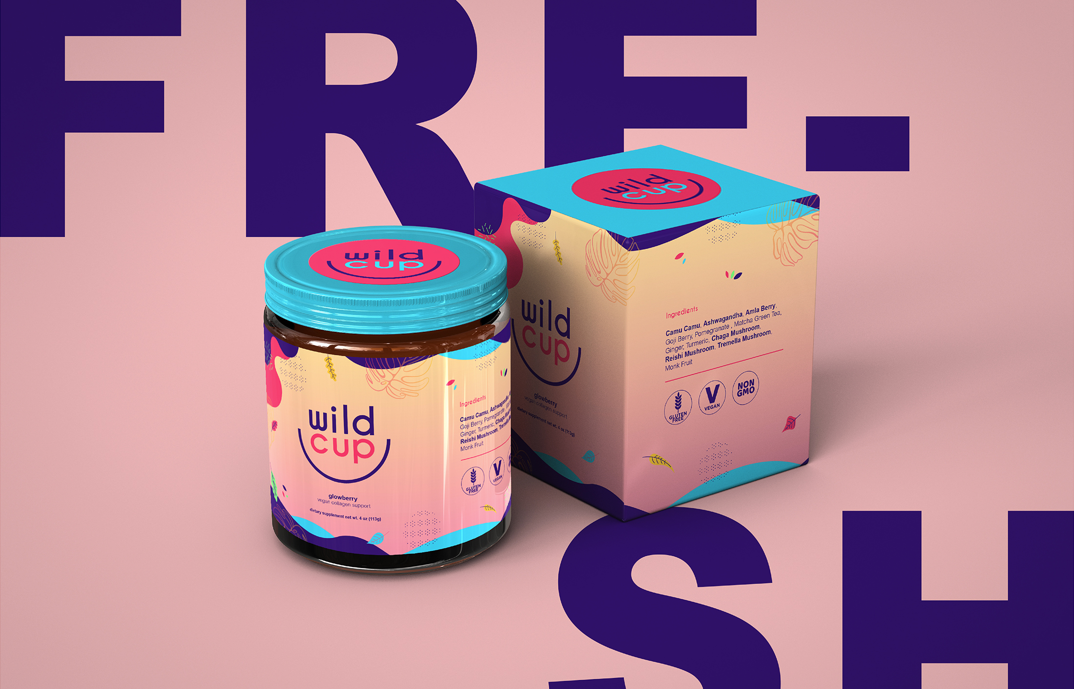
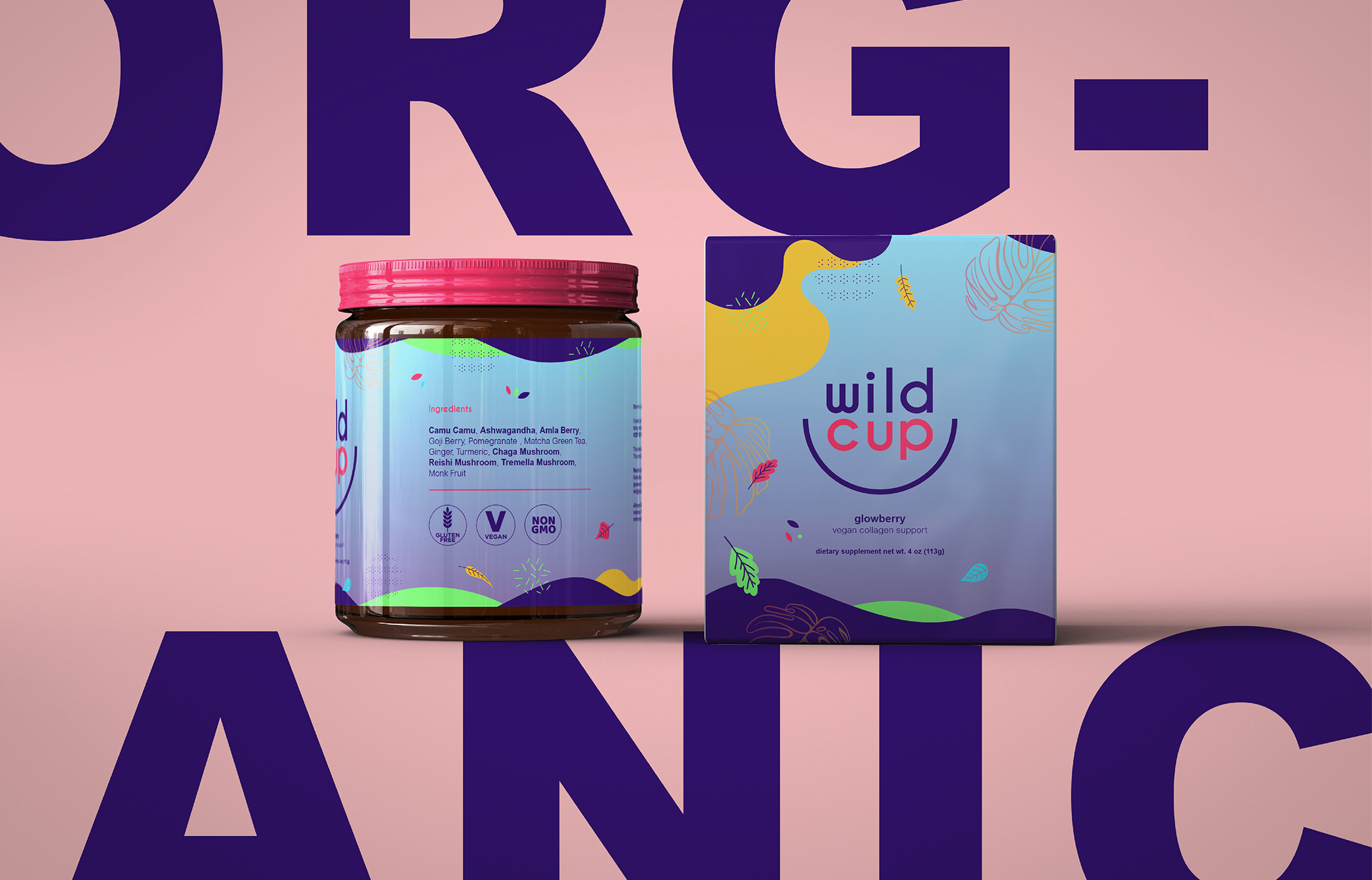
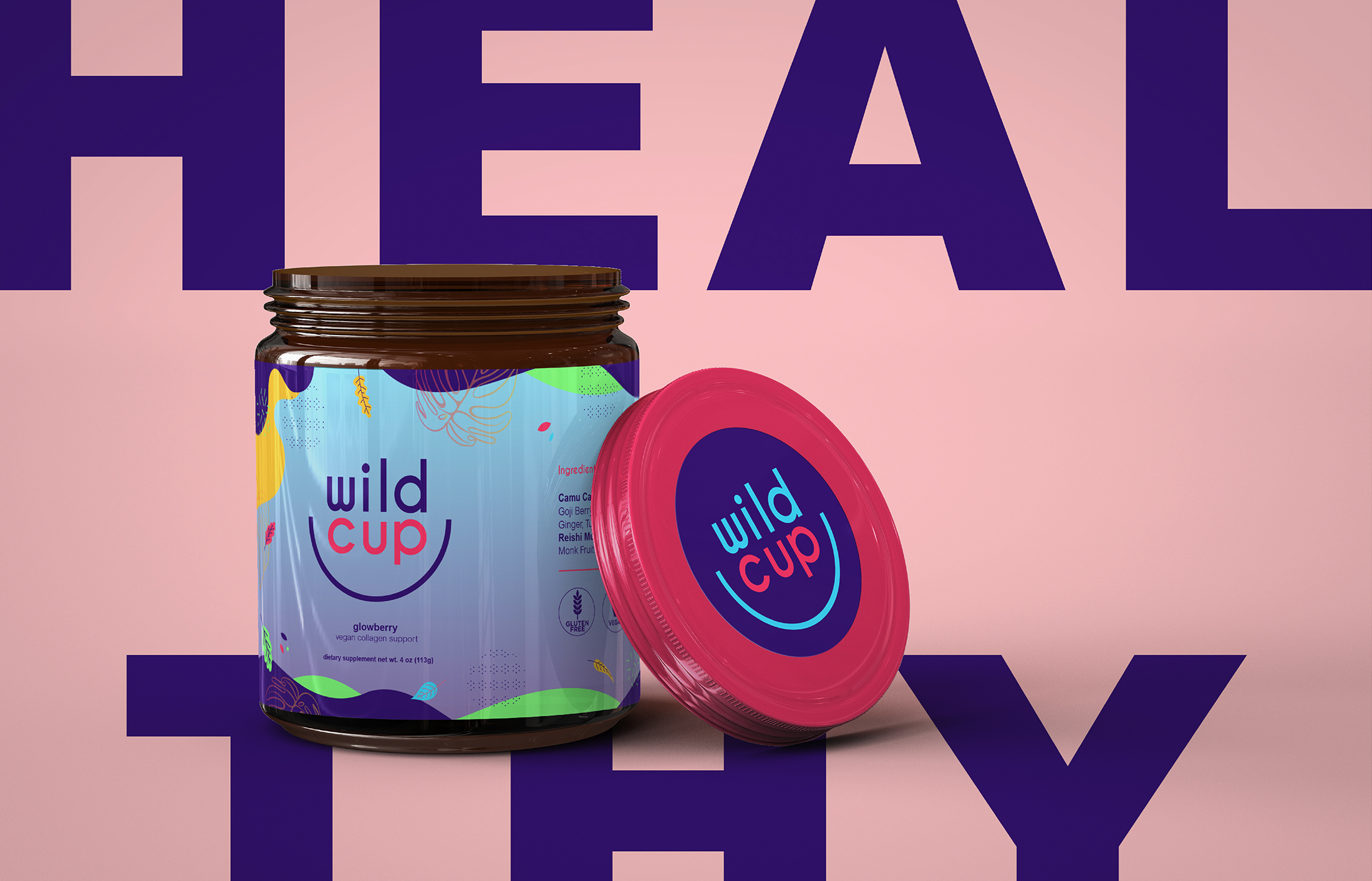
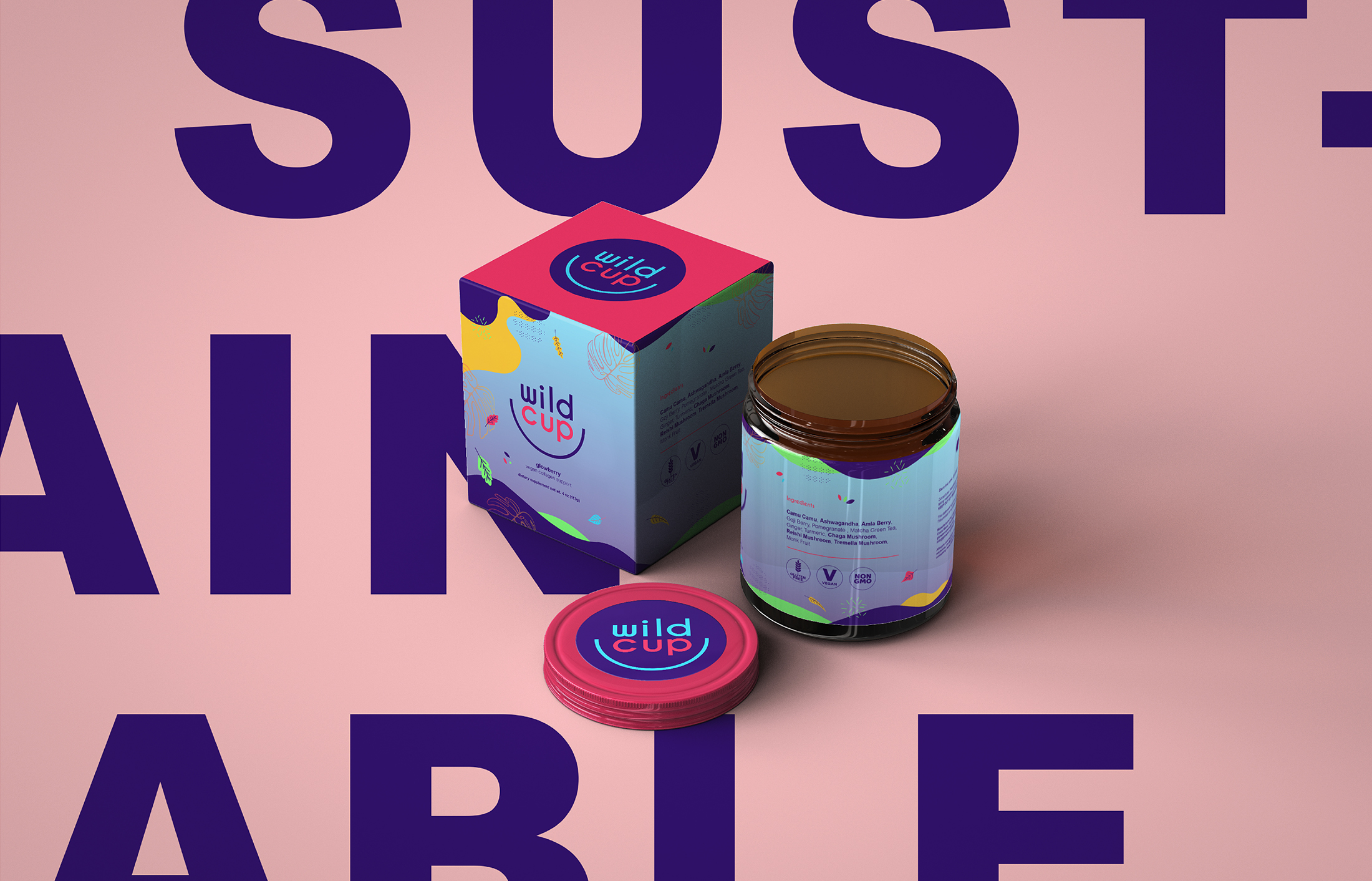
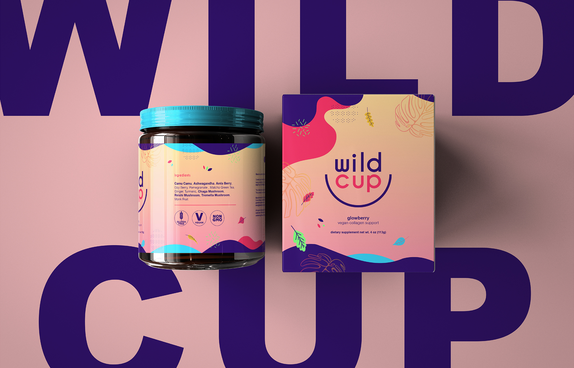
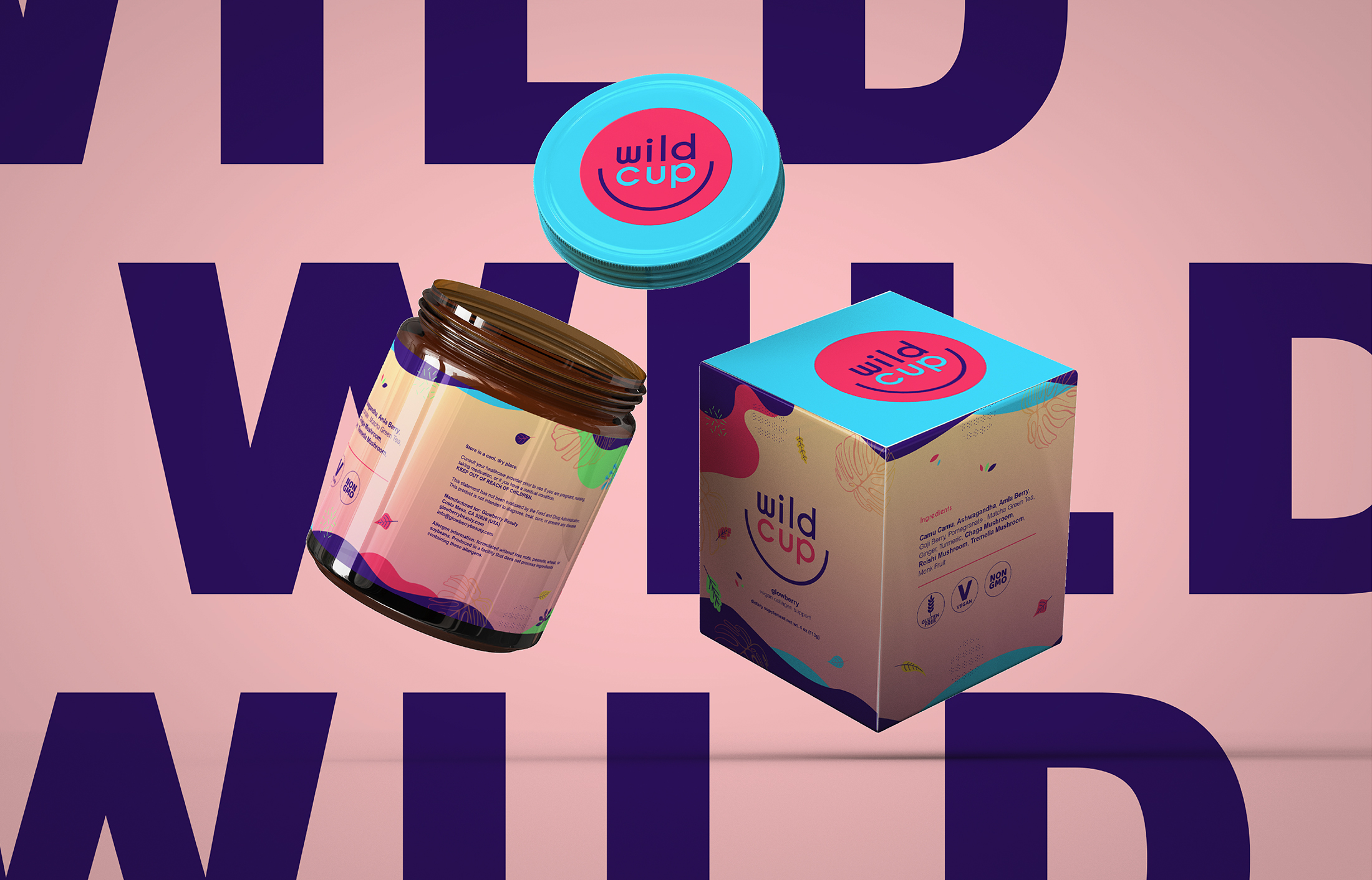
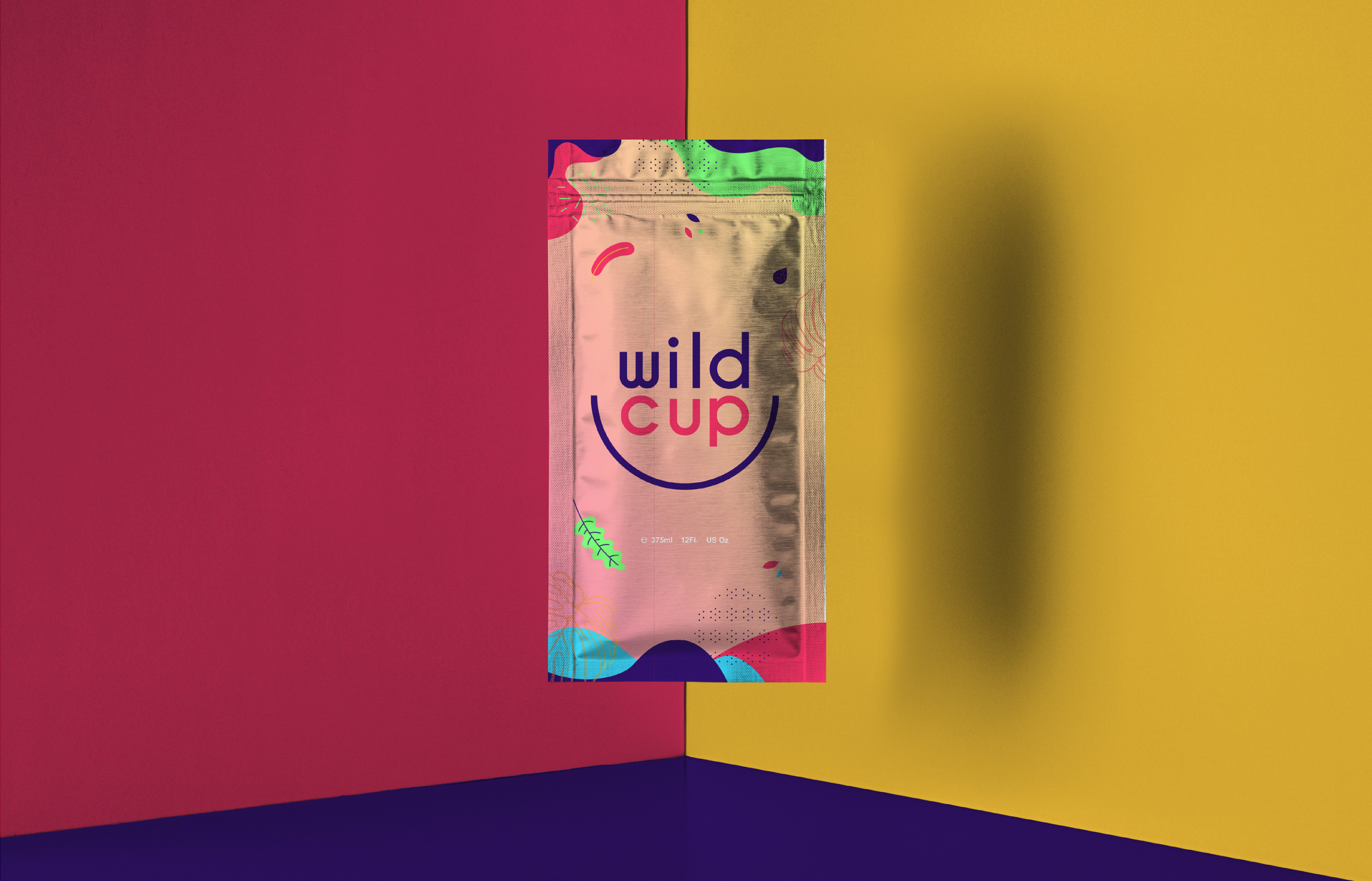
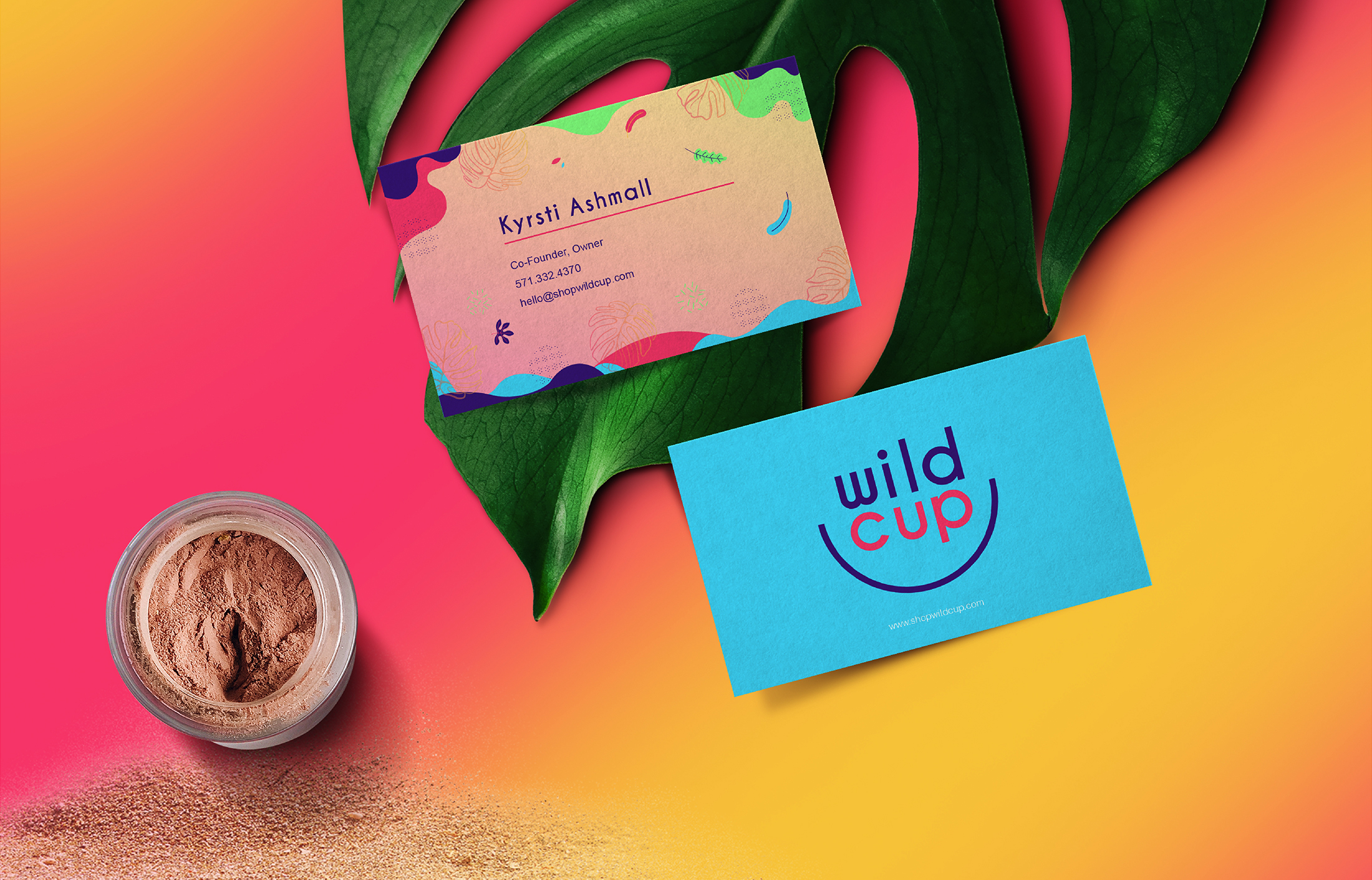
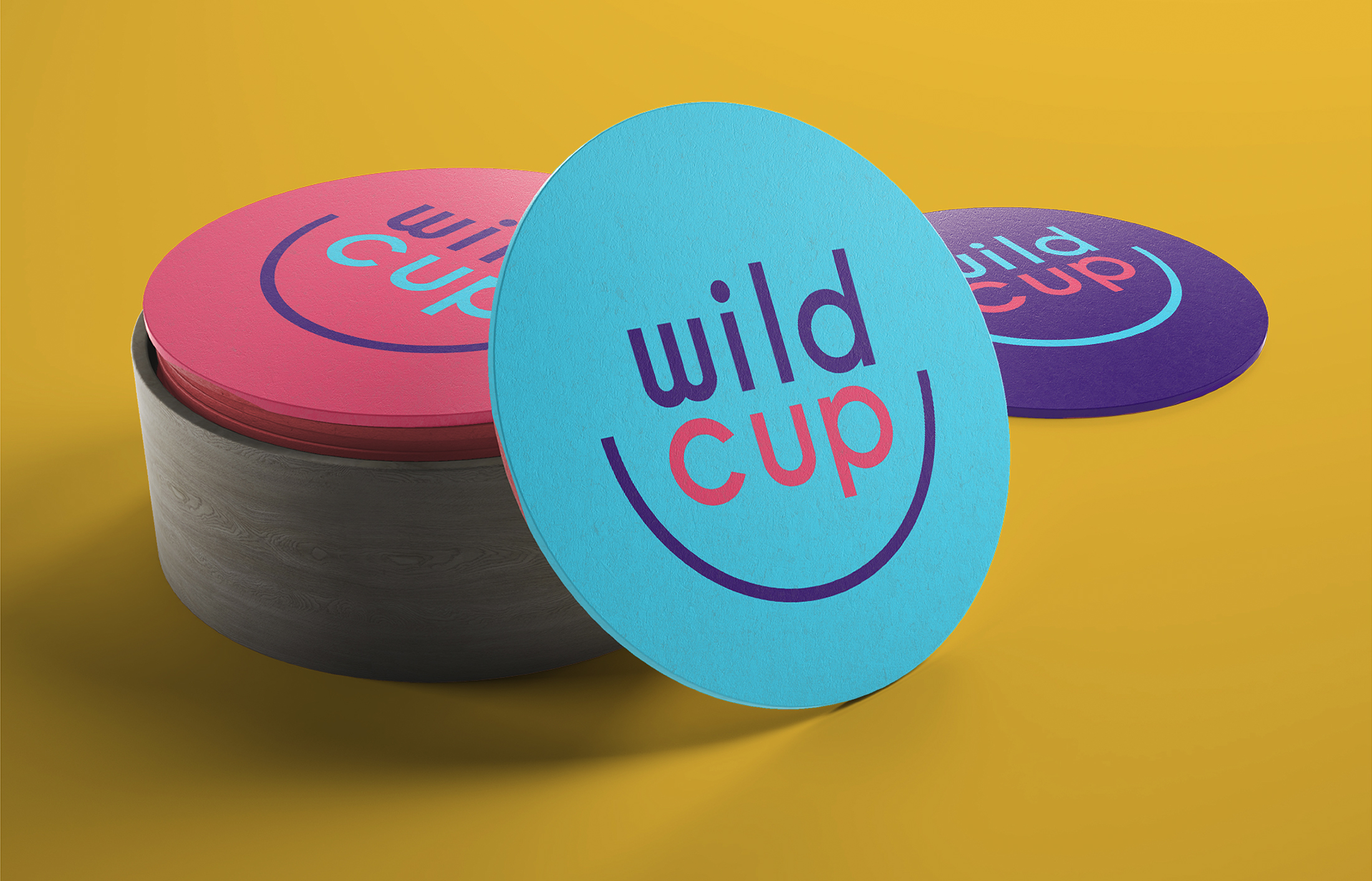
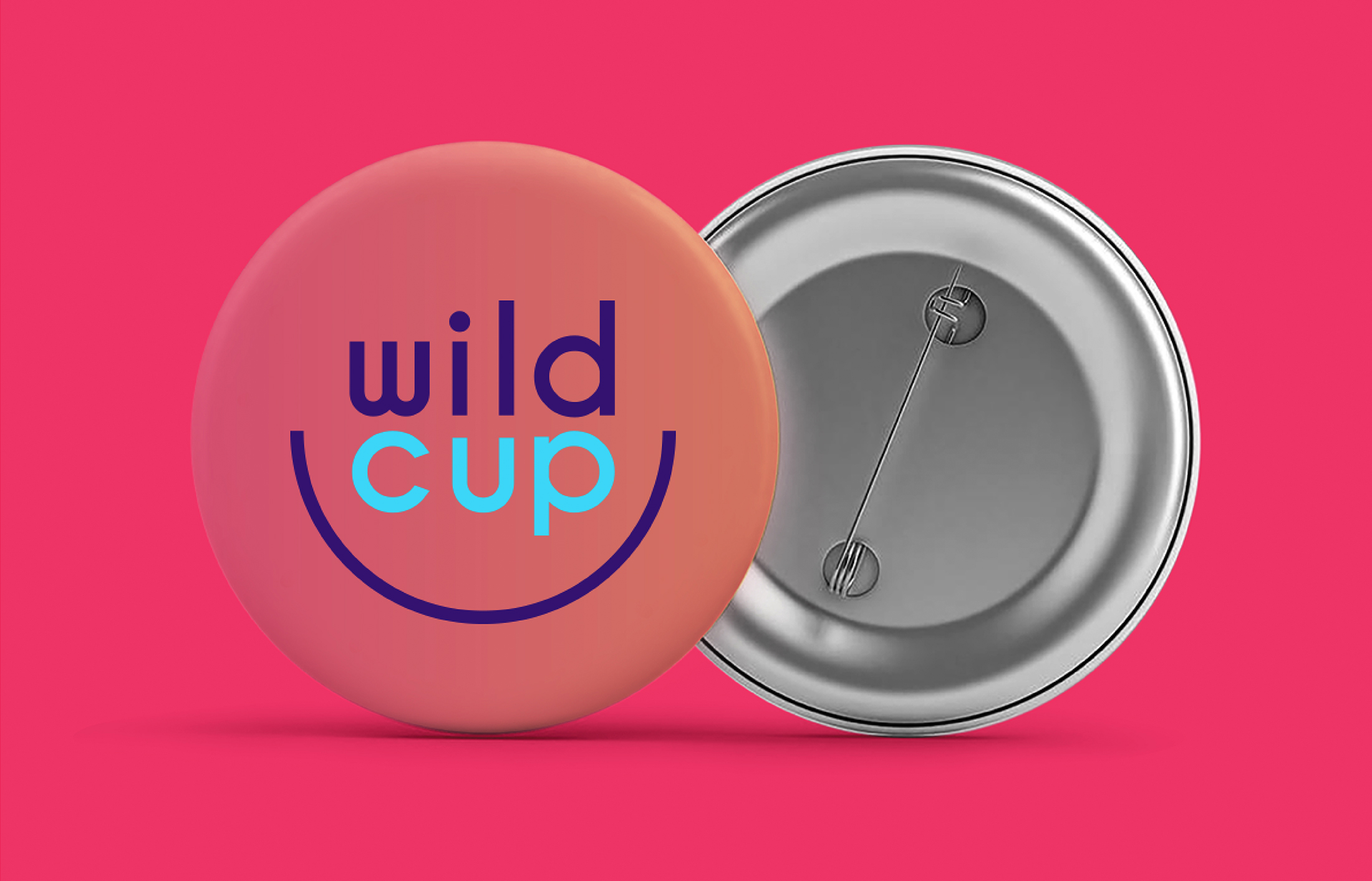
By cupping the identity into a colorfully wild experience, the branding contains organic and fluid-like elements and patterning that compliment the ingredients of the product, supporting the idea of targeting the health-conscious consumer.
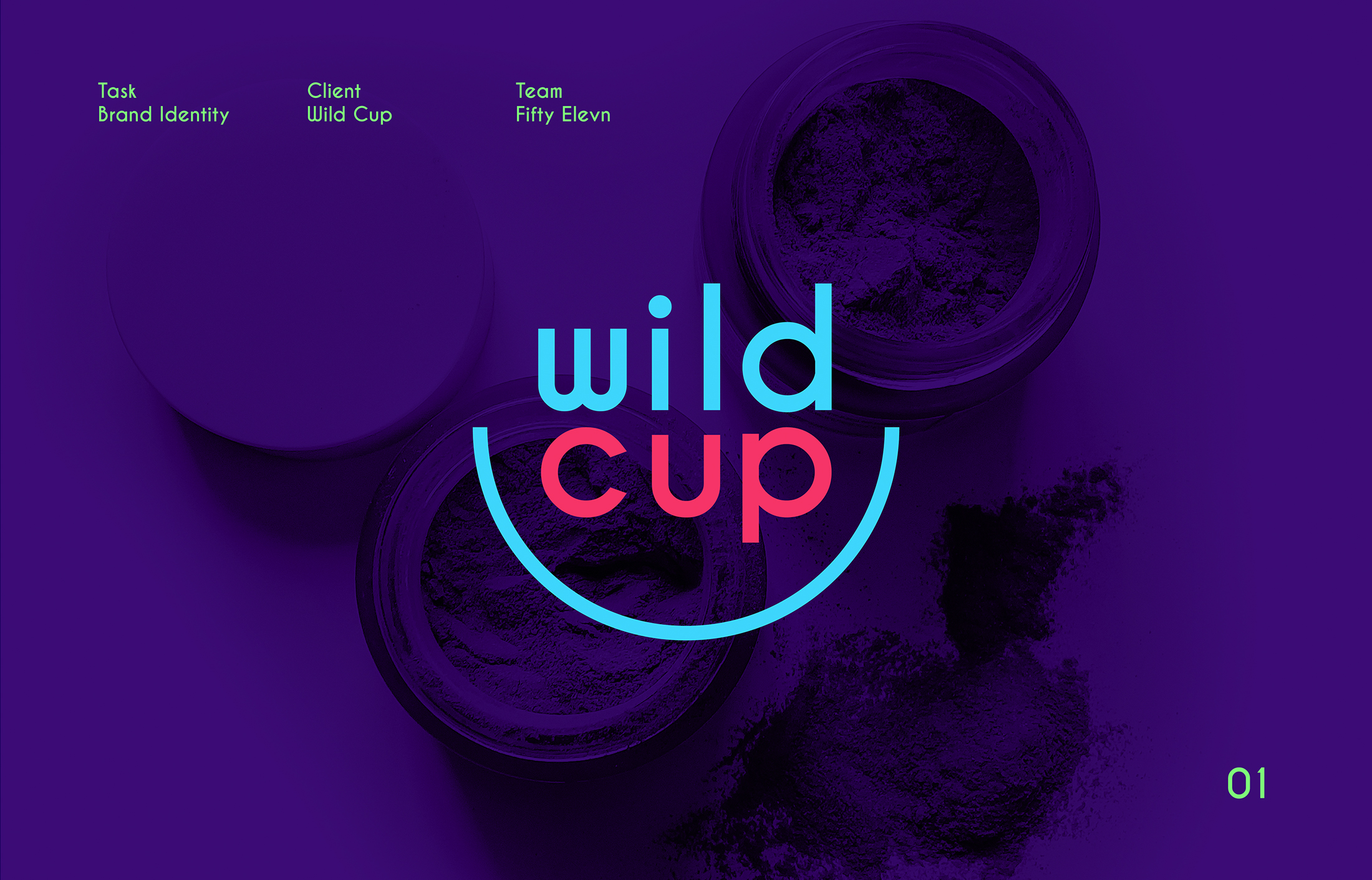
Task
Building a brand from a recipe that smiles back at you and revitalizes your image.
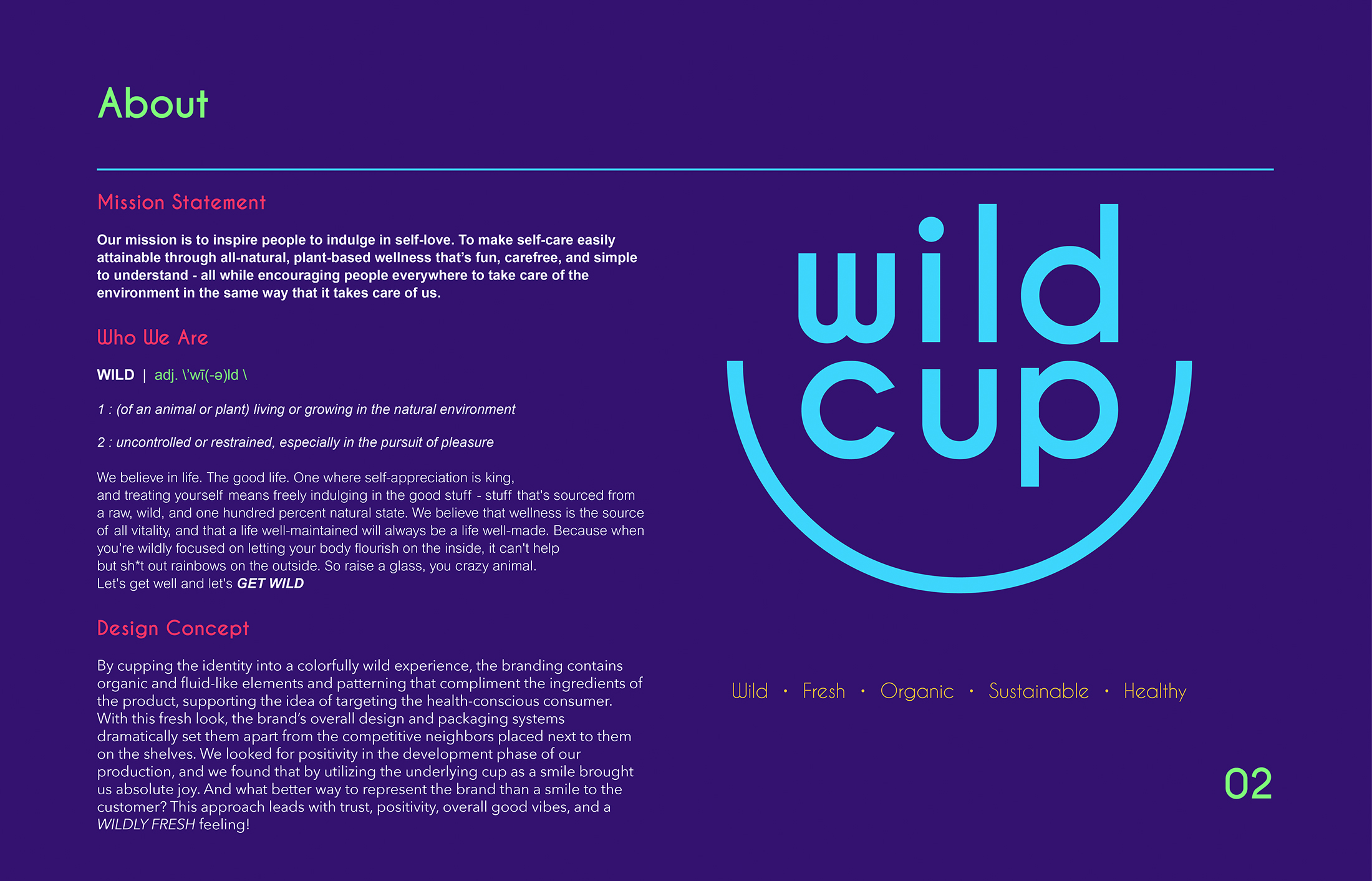
Our mission is to inspire people to indulge in self-love.
To make self-care easily attainable through all-natural, plant-based wellness that’s fun, carefree, and simple to understand – all while encouraging people everywhere to take care of the environment in the same way that it takes care of us.
Who We Are WILD | adj. \’wī(-ә)ld \ 1 : (of an animal or plant) living or growing in the natural environment 2 : uncontrolled or restrained, especially in the pursuit of pleasure
We believe in life. The good life. One where self-appreciation is king, and treating yourself means freely indulging in the good stuff – stuff that’s sourced from a raw, wild, and one hundred percent natural state. We believe that wellness is the source of all vitality, and that a life well-maintained will always be a life well-made. Because when you’re wildly focused on letting your body flourish on the inside, it can’t help but sh*t out rainbows on the outside. So raise a glass, you crazy animal. Let’s get well and let’s GET WILD
CONCEPT STATEMENT
We looked to the most common nuisance animal encountered:The Raccoon.
We took an illustrative approach to the design through a grunge-inspired perspective in order to capture the true essence of a nuisance animal. Taking into consideration the word “trapper” in the brand name, we decided to contain the animal illustration within a typeset lockup as if it were being captured and trapped underneath the words.
PROCESS
Concept Statement
By cupping the identity into a colorfully wild experience, the branding contains organic and fluid-like elements and patterning that compliment the ingredients of the product, supporting the idea of targeting the health-conscious consumer. With this fresh look, the brand’s overall design and packaging systems dramatically set them apart from the competitive neighbors placed next to them on the shelves. We looked for positivity in the development phase of our production, and we found that by utilizing the underlying cup as a smile brought us absolute joy. And what better way to represent the brand than a smile to the customer? This approach leads with trust, positivity, overall good vibes, and a WILDLY FRESH feeling!